Have you ever paused while looking at kimono color names? “Sakura” (cherry blossom), “wakakusa” (young grass), “futa-ai”—you may have noticed that even the same shade of cherry-blossom pink is sometimes shown with slightly different tones depending on the source. This isn’t a mistake; it’s simply a quality that Heian-period color names have always had. Today, let’s slowly unravel the story of color pairing known as kasane no irome.
What exactly is “kasane no irome”?
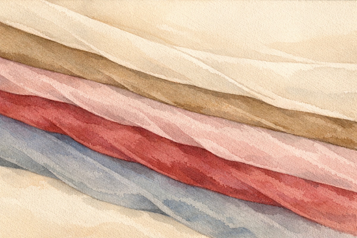
Kasane no irome is a set of color-pairing conventions born in the Heian-period imperial court. Originally, it referred to the colors of the outer and lining fabrics matched together in a lined garment. Later, the same term also came to describe the combined colors that appeared on the surface when multiple layers were worn, as in the twelve-layered junihitoe robe. In writing, the character read kasane meaning “layering of outer and lining fabric” was used for the first sense, while a different character, also read kasane, meaning “layered garments,” was used for the second. Both are pronounced the same way: kasane. The combinations are said to number over 260. It’s also said there were three approaches to kasane no irome: matching colors between outer fabric and lining (the first kasane character), matching colors across layered garments (the second kasane character), and varying the colors of the warp and weft threads during weaving itself. Silk at the time was very sheer, so the color of the lining often showed through the surface fabric, which is said to have produced these distinctive tones.
The gap between modern color charts and Heian color names
Here’s an interesting point—in earlier times, the word “ao” (blue) covered a much broader range of colors than it does now. Everything from blue to yellowish green was grouped together under the single word “ao.” Traces of this remain in words like “aoba” (blue/green leaves) and “ao shingou” (the “blue” traffic light, which is actually green). In Heian-period court dress, “ao-iro” (blue) is thought to have referred to a muted yellow-green. Meanwhile, what we would now call indigo blue was called “hanada.” Even looking at the same character for “ao,” the color a Heian-period person pictured and the color we picture today may have been somewhat different. The HEX codes and RGB values used to present traditional colors today are, at best, approximations. Japan’s traditional colors are said to number over 1,100, and the expression is so fine-grained that even a single pale pink is divided into distinct names such as sakura-iro (cherry blossom), momo-iro (peach), and nadeshiko-iro (pink carnation). Since we’re re-measuring colors that predate digital tools with a digital yardstick, it’s only natural that the numeric values vary from source to source.
Colors for spring, summer, autumn, and winter, and how they were assigned
What makes kasane no irome so fascinating is the way it captures the shifting of the seasons directly in color pairing. The sakura (cherry blossom) color pairing represents a mountain cherry tree—white blossoms opening above reddish young leaves; in the Heian period, “cherry blossom” generally meant the mountain cherry. This color pairing is said to have been worn from winter into spring. Just as with the question of when to wear cherry blossom motifs, colors, too, had a “proper season.” For aristocrats of the time, choosing a kasane no irome suited to the season and setting was considered an essential mark of refinement. For Heian nobles who lived lives of leisure and aesthetic pursuit, the colors they wore may have been a language of self-expression quite separate from politics.
When it comes to records of color names, we shouldn’t overlook the Engishiki, a compilation of regulations that laid out specific rules for dyeing. Thanks to this text, we can still know Heian-period color names in concrete detail today. That said, the names and pairings for the same kasane no irome sometimes differ depending on which family transmitted them, and the systems also varied by era. Comparing a costume manual from the end of the Heian period with one from the Muromachi period shows that the very rules governing kasane color pairings had changed. There was never a single correct answer—kasane no irome was handed down through the generations, shifting along the way. That, it seems, is its true nature.
Bringing the wisdom of color pairing into kimono and accessory choices
So how can we bring this Heian sense of color beauty into our kimono lives today? There’s no need to overthink it. Simply choosing an obiage (a fabric accent above the obi) or han-eri (collar) with an awareness of “a color closer to the outer layer” and “a color closer to the lining” brings you close to the spirit of kasane no irome. For example, adding a touch of a slightly deeper shade than the kimono itself at the collar brings a sense of depth to the whole outfit. This resonates, in its own way, with the idea behind the layered-color kasane, which took pleasure in pairing outer and lining colors. Knowing just one color name is enough to turn the time spent planning a coordination into a small search for a story—which is rather elegant.
Enjoying color alongside motifs
Turning your attention to motifs alongside color pairing adds even more depth to kimono selection. Each seasonal motif (monyou) has color pairings that suit it, and the criteria for choosing differ between auspicious kissho monyou (auspicious motifs) and motifs like cherry blossoms or autumn leaves that reflect the season. By layering these two measures—pattern and color—the story woven into a single kimono comes into sharper, more three-dimensional focus. The more you learn, the more kimono colors start to feel less like a matter of personal taste and more like a letter sent from a thousand years ago.
As you wait eagerly for the unlined-kimono season to arrive, flipping through a color-sample book and imagining the colors that Heian-period people once gazed upon is one way to add a small story to today’s outfit.
Color is half of what a kimono says; the motifs are the other half, as the last section suggests. This introduction is organized by season and pairs hundreds of photographs with notes on colors, fabrics and motifs, so you can see the two working together on real kimono. Please check the product page for current details.