
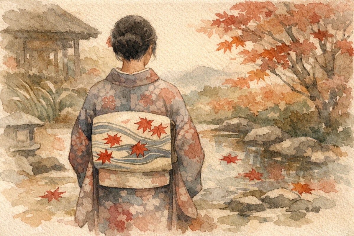
You’ve got a single Tatsutagawa-motif obi (the wide sash tied around a kimono) in hand, and now you’re wondering what color kimono to pair it with — this article is for you. The design of autumn maple leaves drifting on flowing water is so striking on its own that choosing the wrong kimono can leave the obi looking oddly isolated. Have you ever stood in front of your wardrobe on a morning you’d planned for maple-leaf viewing, unsure where to start?
A Quick Refresher on the Colors of the Tatsutagawa Motif
The Tatsutagawa motif (a traditional motif, monyou) depicts colored maple leaves flowing along the surface of a river. The Tatsuta River in Nara Prefecture has long been admired as a famous spot for autumn foliage, and the combination of flowing water and maple leaves has been widely used in kimono and obi designs. The motif traces back to a poem about the Tatsuta River in the Kokin Wakashu, and the more you learn about it, the more you realize that an entire autumn scene is woven into a single obi.
The background color of the obi varies by maker — red, yellow, green, and more. Some consider any design with maple leaves and flowing water to qualify as a Tatsutagawa motif regardless of background color, while others dye the maple leaves themselves in red or yellow depending on that background. There’s no single correct background color, but this background color is exactly the starting point for thinking through your kimono color choice.
Matching Kimono Color by the Obi’s Background Shade
Once the background color is settled, the direction for your kimono color naturally comes into focus. What should you use as your guide? The colors already present within the obi’s pattern. A basic principle of color coordination is that picking a kimono color from within the pattern itself helps the whole look come together. For a Tatsutagawa motif, the candidates are the reds, oranges, and yellows of the maple leaves, and the blues or navy of the flowing water.
- For an obi with a red or vermilion background — pairing it with a calm, complementary color such as mustard yellow, deep green, or unbleached off-white makes the obi’s red stand out beautifully. If you choose a kimono in a similar red tone instead, clearly separating the lightness and darkness of the colors will give the overall look more definition.
- For an obi with a yellow or gold background — choosing a color from the opposite side of the color wheel, such as purple or celadon, makes the obi pop vividly. Kimono in analogous tones like vermilion or orange also blend into a polished, well-put-together combination.
- For an obi with a green background — pairing it with a red or vermilion kimono echoes the maple-leaf colors and heightens the autumn feeling. White or cream-toned kimono are colors that go well with almost any obi, and are a choice that lets the vibrancy of the Tatsutagawa obi shine without competing with it.
Whenever you’re unsure about color choice, the idea of picking up a color that’s already present in the obi is the surest guide to avoiding mistakes. For more on the Tatsutagawa motif itself, see What Is the Tatsutagawa Motif? An Autumn Kimono Story Woven from Maple Leaves and Flowing Water.
Tips for Deepening the Seasonal Mood
The Tatsutagawa motif is best worn in autumn, when the maple leaves are at their peak. If you’d like to layer on even more seasonal atmosphere, it’s a good idea to choose a kimono color with an autumnal depth as well. Mustard yellow, chestnut brown, deep crimson, dark purple — these colors don’t clash with the reds and yellows of the maple leaves; instead, they translate the very air of autumn directly into what you’re wearing.
Alternatively, you might let the blues or navy of the flowing water show through subtly in your kimono accessories. Just a touch of pale blue in the obiage (a fabric accent above the obi) or the under-collar creates a cool, refreshing pause amid the vibrancy of the maple leaves, giving the whole look an endearing quality. That’s the curious charm unique to the Tatsutagawa motif — a sense of coolness within autumn itself.
Combinations to Avoid
On the other hand, what you want to watch out for is using too many colors. The obi alone — with its reds and yellows of maple leaves and its blues of flowing water — is already quite vivid, so if the kimono also uses many colors, the design ends up clashing with itself. It’s best to keep the kimono to around one or two colors.
One more point worth mentioning is the question of seasonal timing. The combination of maple leaves and flowing water is firmly established as an autumn design, but there also seems to be a way of wearing obi or kimono that depict fresh green maple leaves together with autumn foliage as a deliberately early way to evoke coolness in the height of summer. Opinions on handling this seasonal aspect vary depending on personal taste and occasion, so if you’re unsure when to wear it, it’s worth remembering that wearing it during autumn itself is simply the most straightforward choice. If you’d like to know about other motifs suited to autumn, see Motifs to Wear in Autumn Besides Tatsutagawa: How to Choose Seasonal Patterns as well.
In Summary
When choosing a kimono color to pair with a Tatsutagawa-motif obi, the quickest path is to first check the obi’s background color, then pick up one color from the reds or yellows of the maple leaves, or the blues of the flowing water, within the pattern itself. Choosing a color with autumnal depth heightens the seasonal mood, while white or cream tones let the obi’s vibrancy take center stage without interference. If you avoid overdoing the number of colors and aim to let the obi remain the star, your hesitation in front of the wardrobe should ease considerably. Let today’s outfit carry a small story of autumn.